
Media Realm


When Media Realm reached out, their branding was solid. No red flags. Just a sense that it could be doing more.
More polish. More professionalism. More presence.
Their brief to us?
They wanted a light touch — no wild reinvention. Just a refresh that would elevate their main brand and two key products (MetaRadio and Radio Websites) and position them as a serious global player in the media and non-profit tech space.
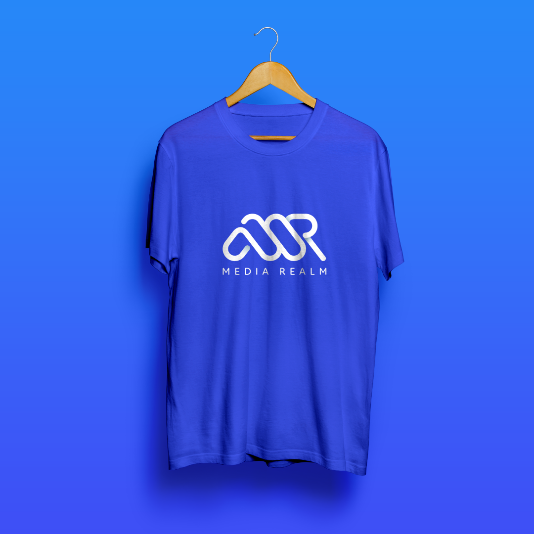
The original Media Realm logo was a Helvetica wordmark — clean and familiar, but a little too… safe. Their product logos? Quick DIY jobs that had hung around longer than expected. (We’ve all been there.)
What was missing?
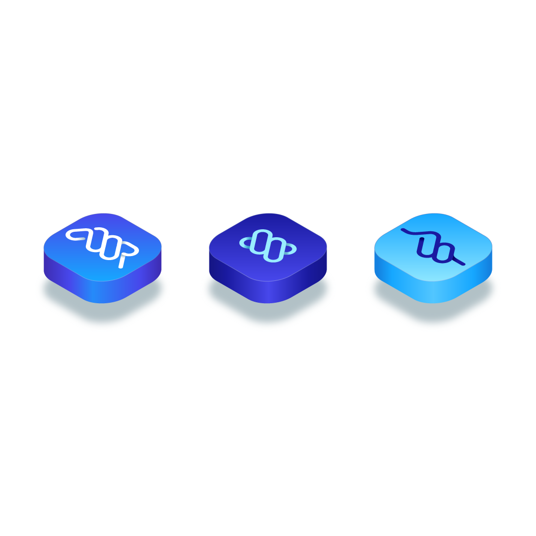
An icon. A flexible system. A sense of connection between the parent brand and its growing product suite.
What was working?
The deep blue palette. The no-fuss typography. The quiet confidence of a team that knows its stuff.
The end result?
We gave Media Realm a brand identity that’s still them — just sharper, smarter, and ready for what’s next.
A refined logo with a custom icon, designed to scale beautifully across digital, print, and product.
A suite of product logos that feel related but distinct — like part of the same family, not carbon copies.
A flexible colour system that balances trust and tech.
A simple style guide to keep everything looking tight, no matter who’s using it.
Why it works
Media Realm didn’t need bells and whistles. They needed clarity, cohesion, and a little confidence boost.
Now, their brand system reflects the quality of the work they’re doing — and gives them room to grow into new markets, new partnerships, and whatever they build next.